Lucerna Bible Font
Commissioned by Tyndale for the New Living Translation Bible
Lucerna is a narrow-width custom typeface designed exclusively to make the Bible more readable
A Name Inspired by Psalms
The name
Lucerna is inspied by the Latin word for “lamp,” based on Psalm 119:105 —
“Your word is a lamp to guide my feet and a light for my path.”
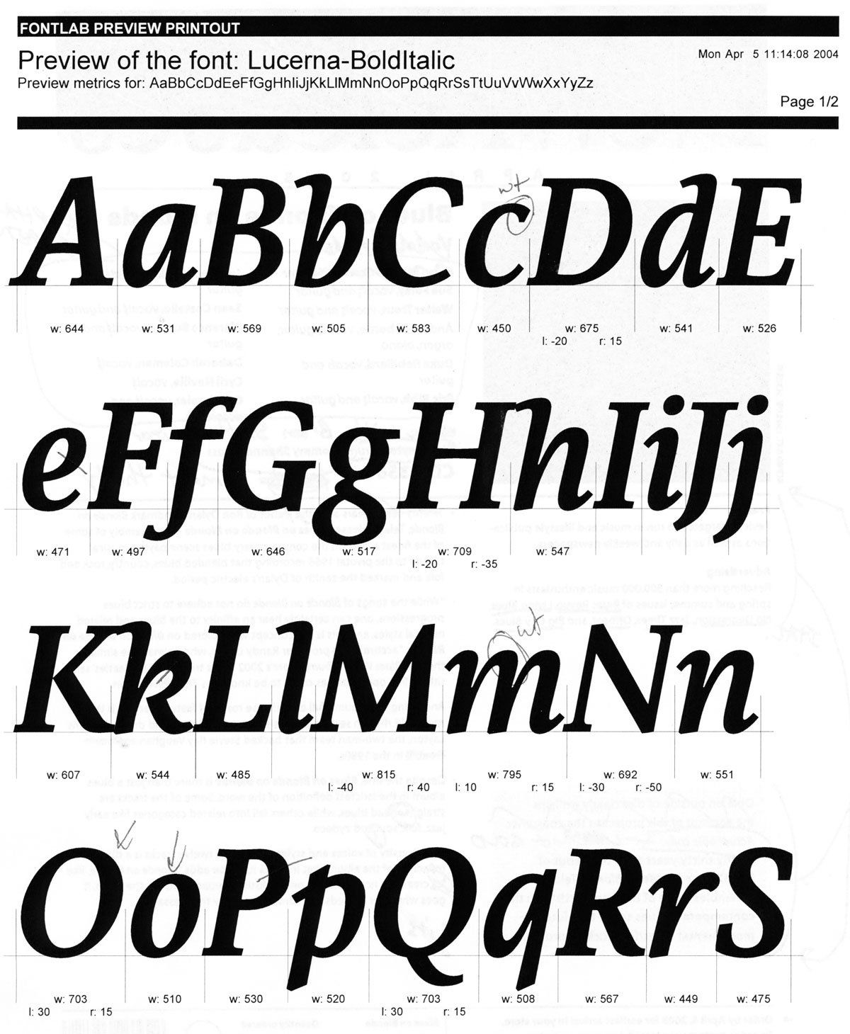
Lucerna’s design is based on Veritas , though the final result bears little resemblance.
Contact us to customize these outlines for your next Bible or publication.
A collaborative design project
A Typeface for the World’s Most Published Book
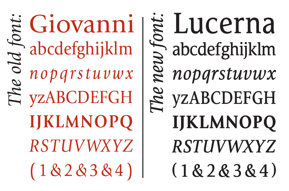
Lucerna overlaid on ITC Giovanni for comparison
What’s the impact of the Lucerna Bible font?
What began as a love for calligraphy and hand-drawn letterforms became a calling when Brian Sooy was inspired to solve a problem.
As he watched how people with limited literacy skills read their Bibles, he saw how the problem of poor page design and layout could be partially solved with a typeface that fit more words per line.
Lucerna makes the Bible easier to read for millions of people around the world every day — people who desire to draw closer to God — and hear His voice.
Lucerna’s roots are in
Veritas AE.
Veritas is used in
GOD’S WORD outreach publications, and the featured font in the new
The Readable Bible .