
The Story of Veritas
Brian Sooy • November 4, 2019
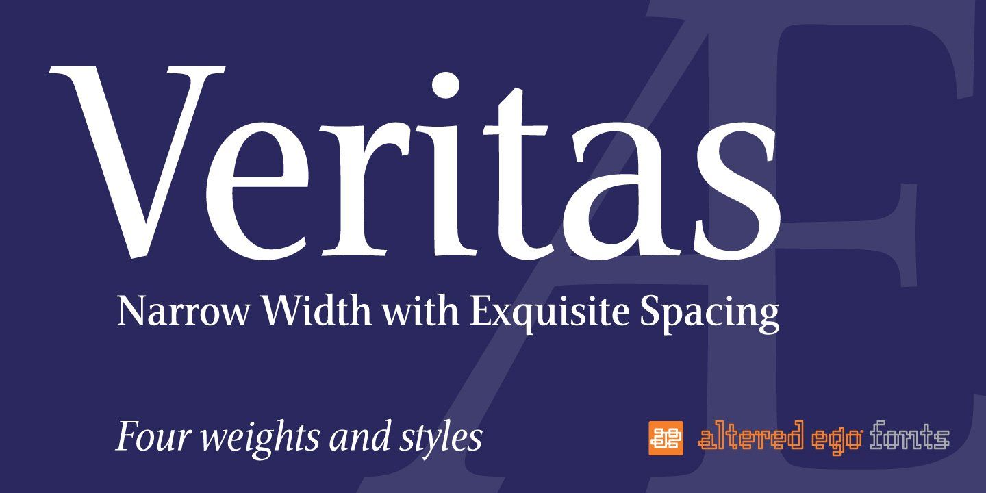
Veritas is designed to be graceful, rhythmic, lyrical. To use musical terms to describe a typeface evokes a comparison to the gestalt of music, individual notes and spaces creating an even tempo and steady rhythm to carry the words. Veritas is Latin for truth.
It is often said that music is made beautiful not by the notes, but the spaces between the notes. The musicality of a typeface is determined by the rhythm of the strokes, the spacing, the tempo at which it carries the eye through the line. It has a tone- a visual look determined by individual characters and spacing working together; it also carries an overtone- reflected in the interplay of counters and bowls; of stems, strokes and hairlines; of inter-character and inter-word spacing. A reader with an attentive eye may notice this only after page after page flows by without strain to the eyes.
Call me Ishmael
Veritas began as a typeface named Ishmael (after the protagonist in Melville’s Moby Dick), became Tempus
after the calligrapher Timothy R. Botts suggested it didn’t look like an Ishmael, and was released after 5 years of labor as Veritas.
Veritas began as a one-axis multiple master typeface firmly rooted in the twentieth century, with a weight range in the roman from Book to Black, and a matching set of weights in the italic. It was one of a few third-party (meaning non-Adobe!) text Multiple Master typefaces available. In fact, the Digital Type Review called it "...one of the most important contributions (and one of the only multiple master families) from any independent foundry..."
With the advent of OSX, Veritas became available as a Type One font, and is now available as an OpenType family.
..one of the most important contributions ... from any independent foundry..."
A Closer Look
Veritas is a reduced-width typeface, (as opposed to condensed) designed primarily for text situations where legibility at small point sizes is an issue, and space is at a premium. It developed out of a practical need for text setting in the narrow columns of magazines and books, and a special desire to see publishers use it for the narrow columns of Bible text setting. Its reduced width allows a larger point size in these applications, and the x-height aids legibility if a larger point size is not possible. It had its beginning in 1989, (predating Stone Print, a family with a similar objective, designed for print magazine) yet was not fully completed until 1995 (although it has been said “When is a typeface ever complete?”).
I’ve never been one for nostalgia, instead valuing the past for the lessons it can teach and the examples it provides, while trying to avoid “mining” for variations on letterforms. Likewise, designing a text typeface which is not strictly based upon, or yet another revival of a typeface from the last three centuries was a considerable challenge. While type design today exists in the vacuum of digital media, it is still necessary to look to something as common as pen and ink to find the inspiration for Veritas.
Our Latin (roman) alphabet finds its roots on a column in Rome (a contemporary typeface based upon these letterforms is Trajan, designed by Carol Twombly of Adobe Systems); providing a mirror to evaluate its many interpretations against. The master who drew and/or carved those letterforms could not have possibly imagined how profoundly his achievement would effect lettering artists throughout the next 2000 years.
Although the letterforms are clearly typographic, they were likely brushed onto the column with a brush as a template before the stonecutter carved them in stone.; therefore they are calligraphic. Those letterforms define the standard of classic proportions; yet the needs of contemporary typography demand constant reevaluation of that standard. Veritas is one example of that reevaluation.
While Veritas and Veritas Italic are based on classical serif Roman type, they take their inspiration from a variety of contemporary sources: Photina; Sabon, Stone Serif; Hermann Zapf’s body of work; personal study with Yovica Veljovic. Stone Print was also studied, as reference for a condensed serif typeface. It is designed to be as space-efficient as the venerable Times Roman, and has a very similar character-per-pica count, and a taller x-height. It incorporates some of my own ideas regarding serifs and legibility, with a 60% cap-height x-height.
Veritas incorporates some “modified serifs” (such as in the n, i and l) yet each character balances as if it were firmly planted on two feet. The serifs are at a size appropriate to the typeface, and serve very well to aid the eye in following the line.
It is a humanist typeface in that the character stems and strokes are “waisted.” Tapering slightly in the optical center. This softens the typeface, freeing it from the rigidity and stiffness of a typical digital typeface.
It is necessary to discuss the italic as another typeface, which it really is. Designing an italic which is similar but different to an accompanying roman is a challenge of aesthetic, letter spacing and weight considerations. Veritas Italic has been called calligraphic, and indeed it is based upon classic Italian letterforms, mirroring the thick and thin flow of a chisel nib. It is closest to a lyrical modernist italic letterform (print a paragraph of Palatino Italic off of your laser printer, (see sidebar) One exception is the lower case g, which remained a modified oblique version of the roman g for aesthetic purposes. It is obliqued at approximately 11 degrees for those who are counting.
Veritas is carefully letter- and word-spaced, is kerned in the number set for more even setting in text situations, and has a very large total kern set to allow for the finest of typography, including diacritical characters. Veritas includes a full European character set, for international use. Over 1000 characters were created to complete a one axis MM roman and italic. Suffice it to say, each character is designed to be beautiful by itself; in combination with its brothers and sisters, and in combination with its cousins.
Sensible Typography
Publications such as books, annual reports, magazines and Bibles rely on narrow column widths to fit the most copy in the least amount of space. This forces the typographer to either reduce the point size of the text to an uncomfortable reading size, or to design with column widths that produce less-than-optimal character counts (45 to 65 characters per line) for legibility, or both. Condensed text typefaces, with their misproportioned x-heights (such as ITC Garamond Condensed) fit more copy to a line while sacrificing legibility.
Other factors such as abnormally tight letterspacing and poorly justified paragraphs further complicate the issue. Bible publishers in particular should be taken to task for this as Bibles are the most widely read books on the planet. A message of such value needs to be made as legible as possible. Veritas was originally intendede for use in such books (hence the name) and has been used by Bible publishers such as Tyndale House and Thomas Nelson.
Veritas addresses these concerns in several ways. A narrow (not condensed) width was chosen which alludes to classic proportions; a moderate x-height (2/3) to aid legibility and a form intended to allow the message to be of most importance. Veritas does not distract the reader by the distinctiveness of its design, but is intended to become a medium of maximum transparency to illuminate the message. (the other extreme is when meaningless/contentless language is given meaning by the design of the typeface, but that’s another story). Veritas’ more distinctive characteristics are evident in the italic, where the emphasis should logically fall by virtue of the appropriate use of italic.
As text, it is meant to “disappear,” allowing the content of the message to be of first importance. This is important as we do not read individual characters in a word, but we read the word as a whole, recognizing the combination of letterforms that become the word. The gestalt principle of reading then lets us recognize combinations of words, which then provide context and greater meaning to the whole. A well-designed typeface aids this process by contributing to this ease of recognition.
The letterspacing, word spacing and kerning factors combine to allow even inexperienced typographers the best chance to set legible text. (most designers fail to adjust the word and letterspacing features of layout programs like InDesign, so a well-spaced typeface is essential).
There are too many people who value the printed page to allow typefaces such as Veritas to languish in a digital type case. Veritas serves as the basis for additional typefaces, as did type designed by Frederick Goudy and other master type designers.
The exploration of new letterforms can be extreme, as in degenerative (ie grunge) typography, or subtle, as in the case of Veritas, experimenting with the subtle aspects of type to produce a whole greater than the sum of its parts.