
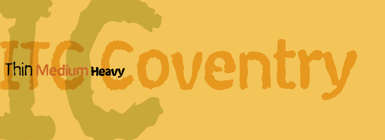
ITC Coventry™
A distressed typeface for publishing, packaging, and band flyers everywhere.
If you look closely you’ll see the roots of a handsome sans serif font buried under a layer of grime and rust. ITC Coventry™ is a rust belt typeface.
ITC Coventry isn’t just distressed, it’s like the end of a bad day at the office.

Coventry was inspired by a trip to the Coventry section of Cleveland Heights, Ohio. It’s not uncommon for students at the Cleveland Institute of Art and Case Western Reserve University to post poorly-reproduced flyers with tear-off tabs, looking to sell or rent something. It is one of those flyers which inspired Coventry, which makes it an “objét trouve.”
Coventry’s evolution began with the intent of creating a font that would be quick to create, and when reproduced would give the appearance of being poorly photocopied, or faxed, or both. It’s not necessarily a "grunge" face, or deconstructivist, but simply distressed, like it’s the end of a bad day at the office.
Coventry’s evolution began with the intent of creating a font that would be quick to create, and when reproduced would give the appearance of being poorly photocopied, or faxed, or both. It’s not necessarily a "grunge" face, or deconstructivist, but simply distressed, like it’s the end of a bad day at the office.
ITC Coventry Single Weights from $35
ITC Coventry Package from $104


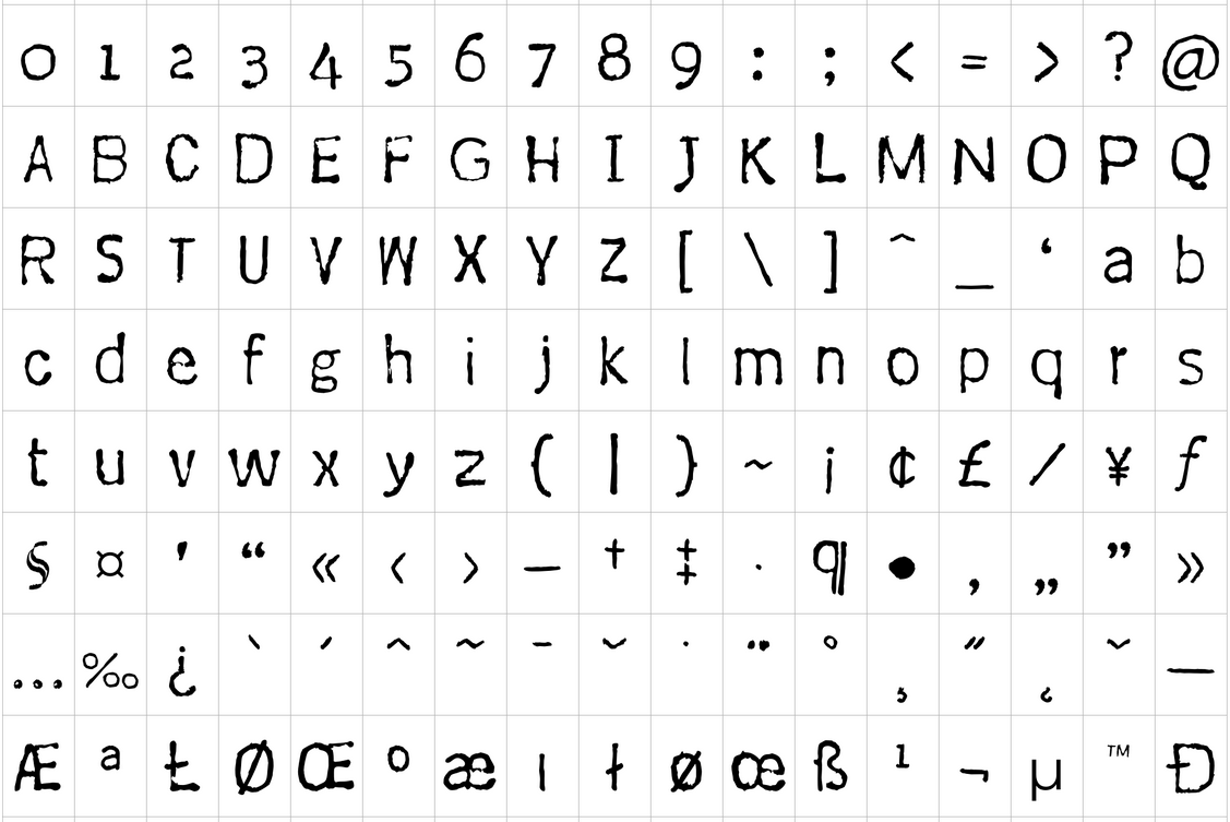
If ITC Coventry has any historical reference, it’s a very short history. I wasn’t attempting to mimic any grunge fonts, I was attempting to create a font that stylistically appeared distress but remained highly legible.
If you look close you’ll see the roots of a handsome san serif font buried under a layer of grime and rust, basically. Coventry is what type would look like if you left a gothic font out in the rain. The numbers are unusual in that they are old-style figures, but old-style figures are very contemporary now, and that makes these numbers very hip.
What is remarkable about the face is that after all of the convolutions to create irregular edges and character shapes, it is highly legible in all sizes, especially on billboards. While I don’t anticipate its use in a Bible anytime soon, I can see it used in publications and advertising for a textural effect that still communicates.I suppose it would even work well on a business card.
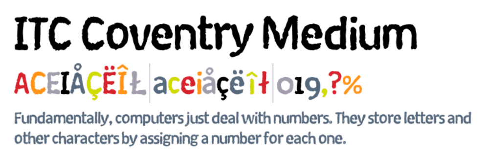
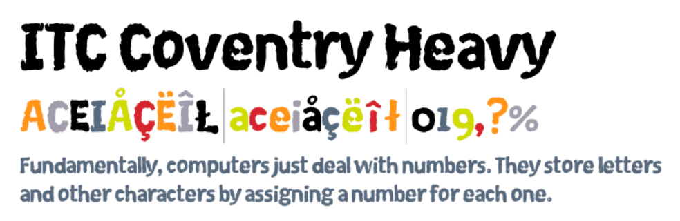
It was created in three weights to allow for layering and textural variety in text settings, and a hierarchy of weights for headlines.
If you look close you’ll see the roots of a handsome san serif font buried under a layer of grime and rust, basically. Coventry is what type would look like if you left a gothic font out in the rain. The numbers are unusual in that they are old-style figures, but old-style figures are very contemporary now, and that makes these numbers very hip.
What is remarkable about the face is that after all of the convolutions to create irregular edges and character shapes, it is highly legible in all sizes, especially on billboards. While I don’t anticipate its use in a Bible anytime soon, I can see it used in publications and advertising for a textural effect that still communicates.I suppose it would even work well on a business card.
It was created in three weights to allow for layering and textural variety in text settings, and a hierarchy of weights for headlines.
ITC Coventry in Culture and Commerce
Who uses ITC Coventry?
ITC Coventry™ is a top choice for recording companies like Concord Records, manufacturers like JBL, publishers, and discerning brands in every sector.
ITC Coventry has been spotted on posters, packaging, Bibles, and more.
ITC Coventry is a registered trademark of Monotype.